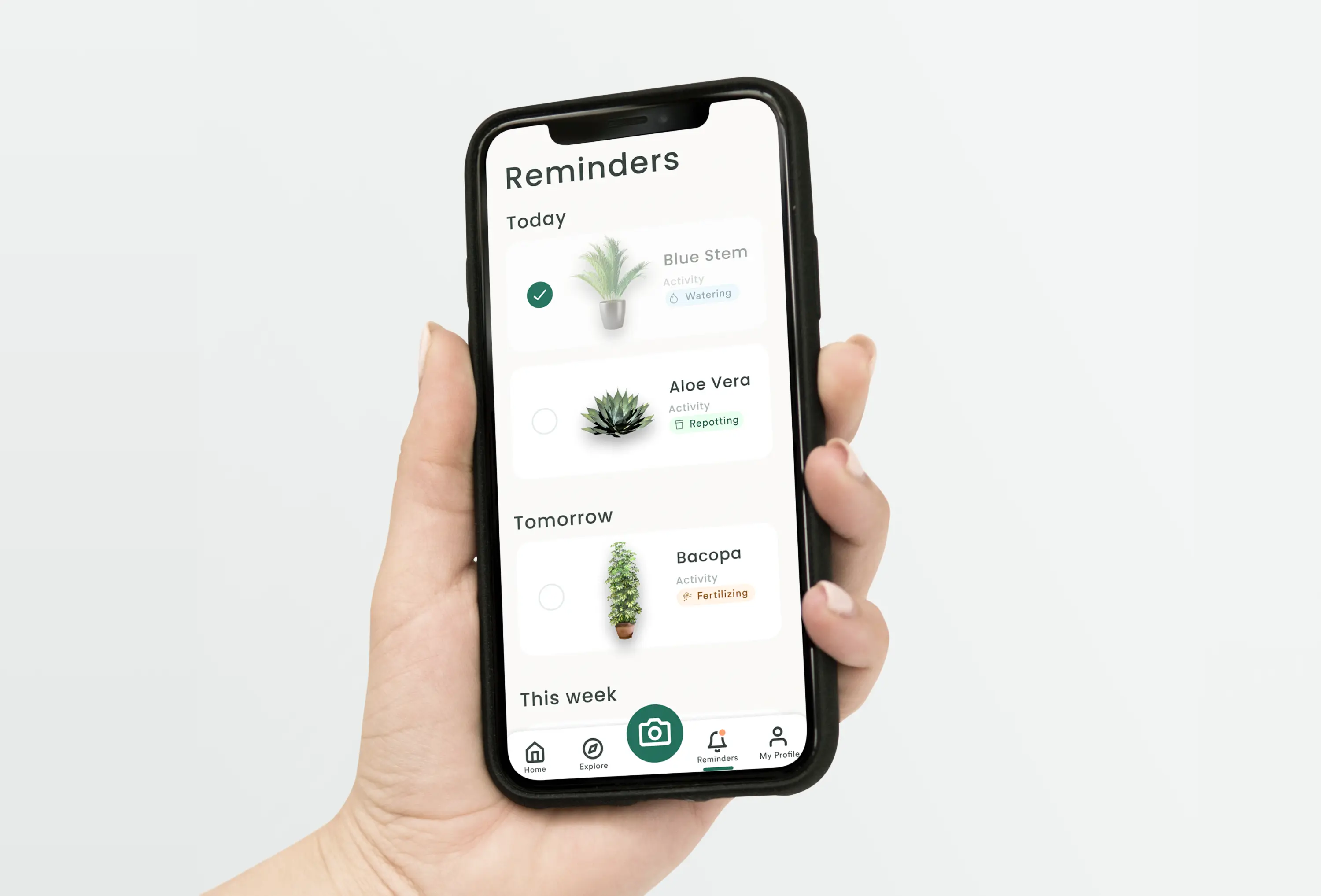
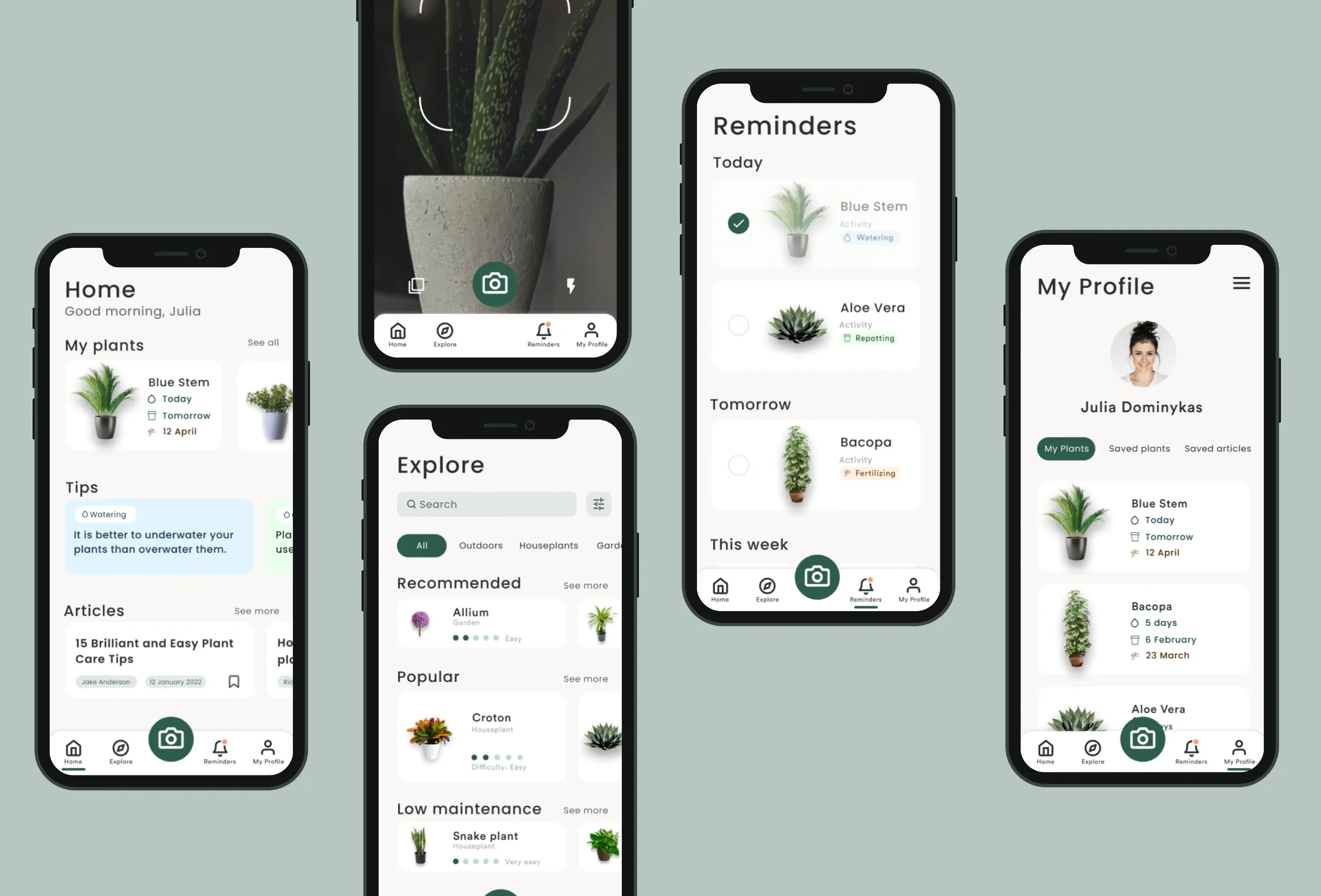
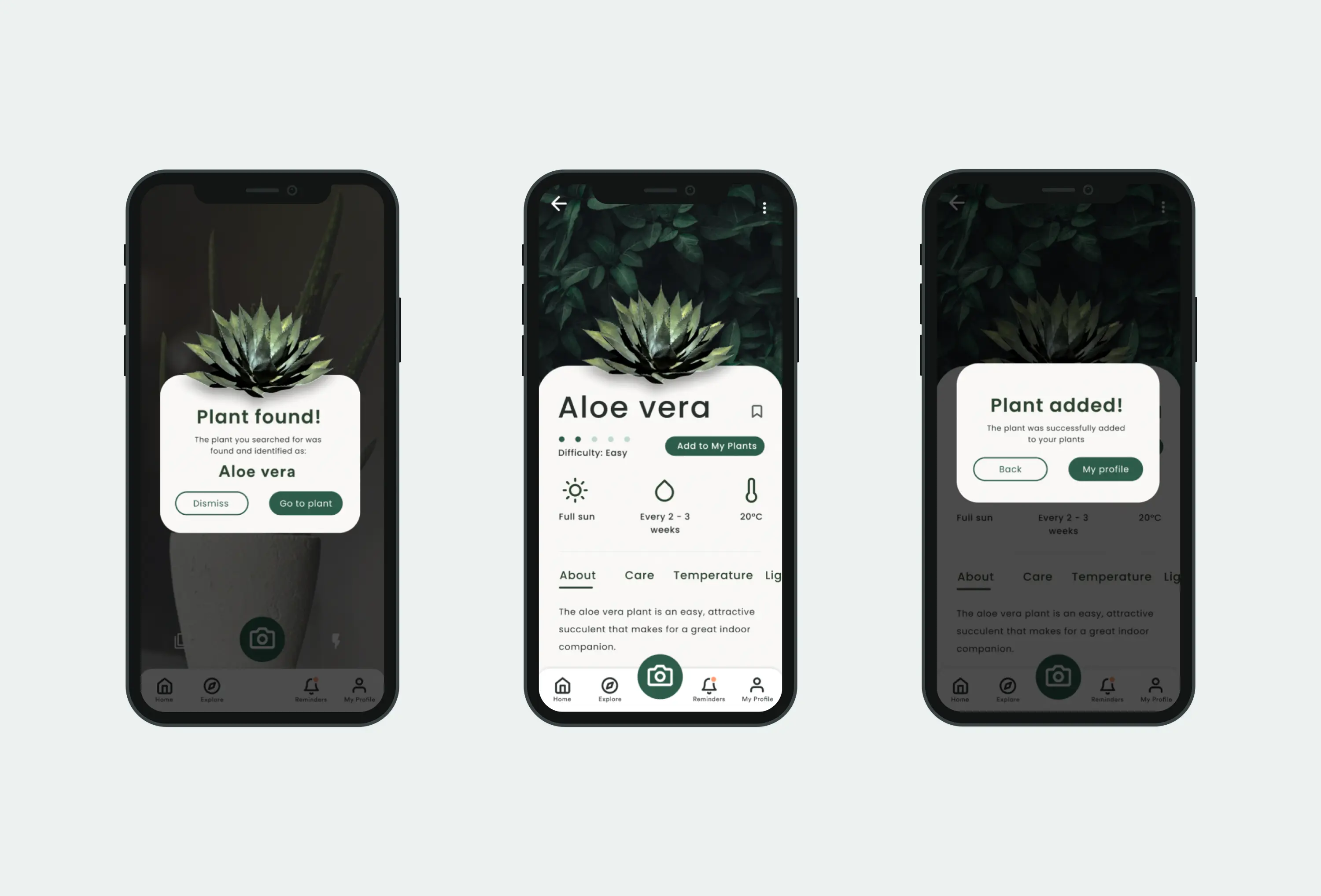
How can we design an app that makes it easier to care of your plants?
Exam in Interaction Design 1
This exam consisted of a two month process where I worked with two other students. We designed and user tested an app with the goal to help people take care of their plants.
Focus: The design process, design principles, user testing, justification of design choices.


The exam assignment
You will develop a new digital product or service. If desired, you can also redesign an existing solution. The solution you develop must be digital and have a screen-based interface. The solution will focus on the target group and will help users in a specific situation, either at school, work or leisure. For example, it may be a solution you yourself miss in everyday life.
My role
My role and responsibilities was designing and overseeing designs, incorporating design theory, creating documents, as well as organizing and executing user tests


The result
Grade: B
Through utilizing what we have learned through lectures we achieved to create a good looking plant app, where the insights from the four usability tests were generally positive, but some areas could be improved.
As this was our first Interaction design project, it was a very valuable learning experience and at the end of the project we knew what was required to refine the design process and how to execute great user tests of good quality for our next project.


How we approached the assignment
We used a general design process (Explore-Design-Develop) to improve teamwork, set clear expectations in the group, and to create more efficiently and creatively and meet the user’s needs.
After we had decided what we wanted to created we entered the Explore phase. In this phase we explored, discovered and researched the users, their needs, problems, goals for the solution and existing solutions.
In the Design phase, we brainstormed together the structure and navigation, and later brainstormed ideas and sketched how each page could look like. All members presented their ideas. We discussed, used each other’s ideas to generate more ideas and democratically voted on the best ideas - Thus, narrowing the amount of ideas down and ending up with the best ones.
We created low-fidelity wireframes based on the best ideas to save time and to test the ideas and easily make changes.
After the creation of the prototypes we made usability tasks, wrote the test script, created the document for insights and observations and defined the usability goals. We also recruited four test participants. I was both an observerer and facilitator during the usability tests. After each test we went through the observations and graded them on a consequence scale.
After all the user tests were completed, we prioritized what we regarded as problems on a scale from 1 to 5.